Context
Clastix Enterprise Platform is a self-service, multi-tenant Kubernetes platform: hosted control planes, declarative cluster management through the Cluster API, hard multi-tenancy, and a single console for an entire fleet of clusters. It was the company’s move from its open-source projects — Capsule and Kamaji — to a commercial product.
The engagement came after my event work for Clastix at SUSECon and KCD Italy. Having designed how the company presented itself, I was asked to design what it sold.
- StackTailwind CSS
- Target usersPlatform engineers & operators
- EngagementFreelance, external collaboration
Challenge
An interface already existed, but there was no product design behind it. It was thin, and it did not represent what the product was actually for: operating a fleet of Kubernetes clusters without misconfiguring any of them.
The gap was not visual polish. It was that nobody had yet decided how the product should work.
The approach
The product was at launch stage, so I sized the structure to that stage rather than to an imagined future: enough system to keep the interface coherent as it grew, not so much that it became a project of its own — and all of it designed against the technical reality the frontend was built on.
A small design system, deliberately small
I built a compact design system — colour, base components, the underlying rules — rather than a comprehensive one.
The interface did not need heavy structure at launch. What it needed was consistency, and a foundation that would not have to be undone later. The alternative was to build each screen with no system at all: faster for the first ten screens, expensive for every screen after that. Tailwind was the CSS standard on the frontend, so the system was defined against Tailwind’s colour and spacing scales from the start. A design system that argues with the framework it will be built in is a design system that gets ignored.
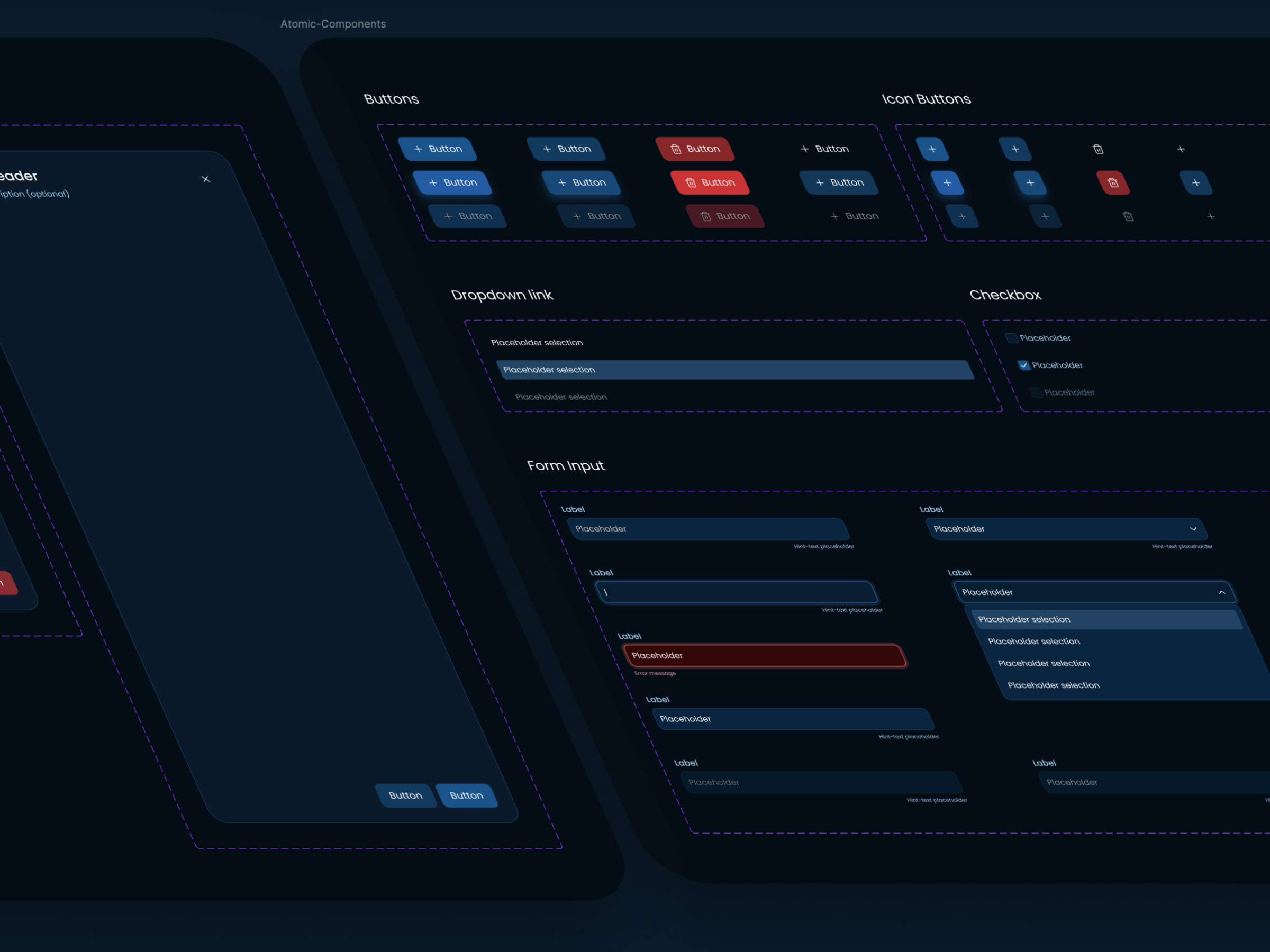
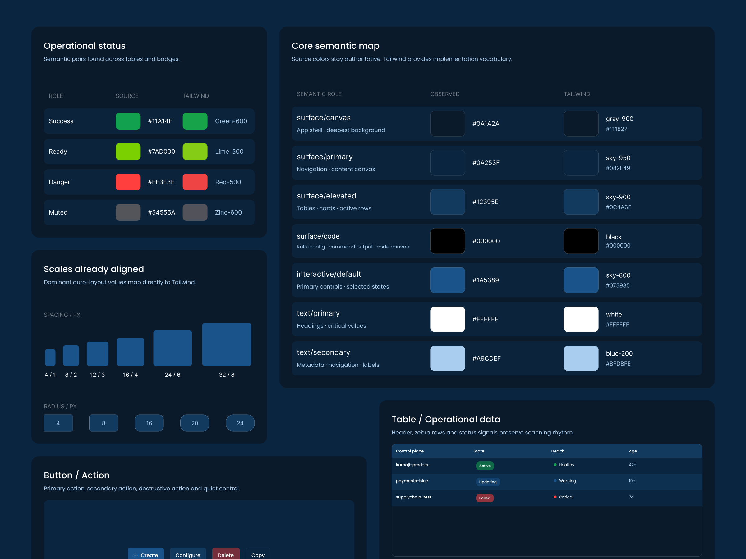
Redesigned for the people who would actually use it
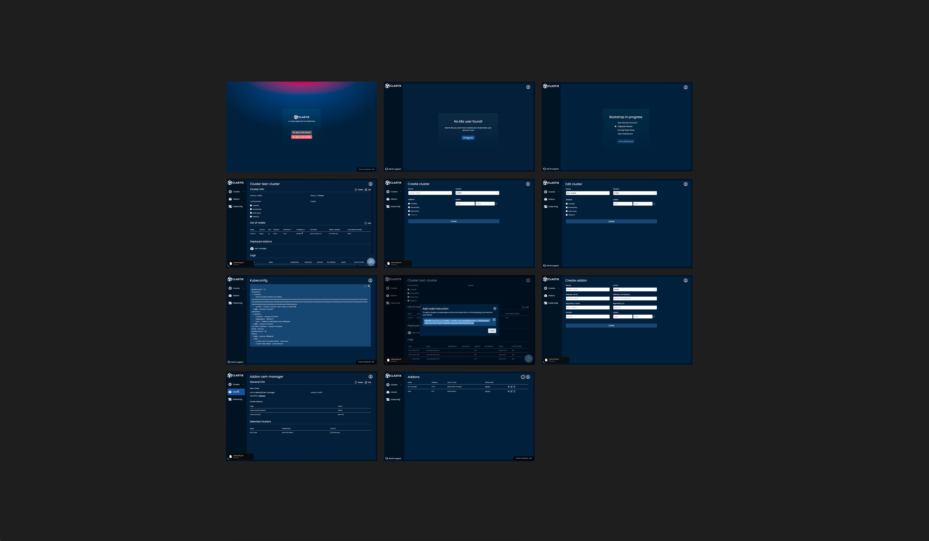
I redesigned the existing interface end to end, around the working logic of a technical audience.
The alternative was to leave it as it was and add to it. That would have preserved the original problem: an interface that showed what the system contained without supporting what an operator was trying to do with it. Platform engineers do not browse a console — they arrive with an intention, and the product either matches it or gets in the way.
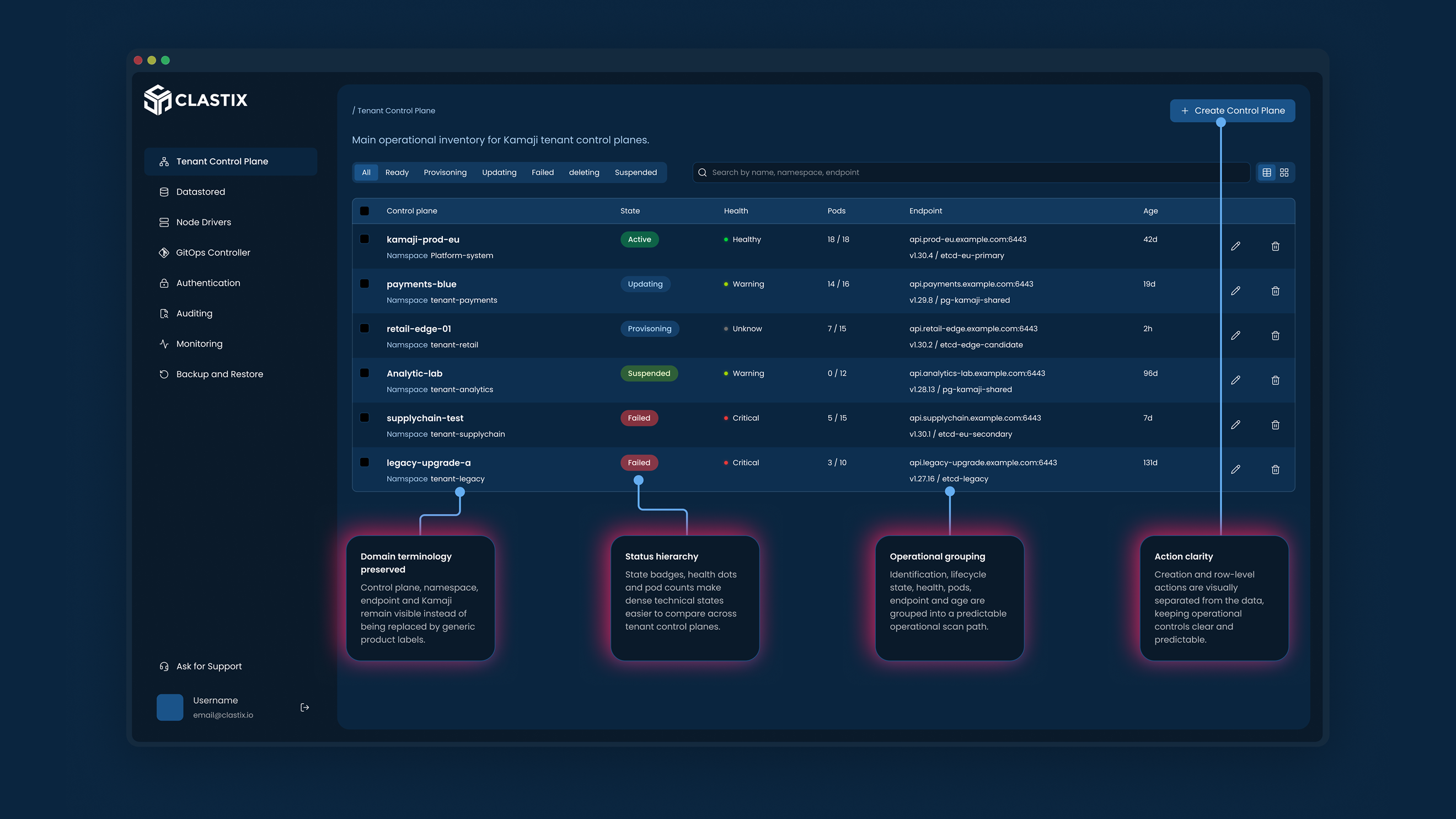
The prototype as the specification
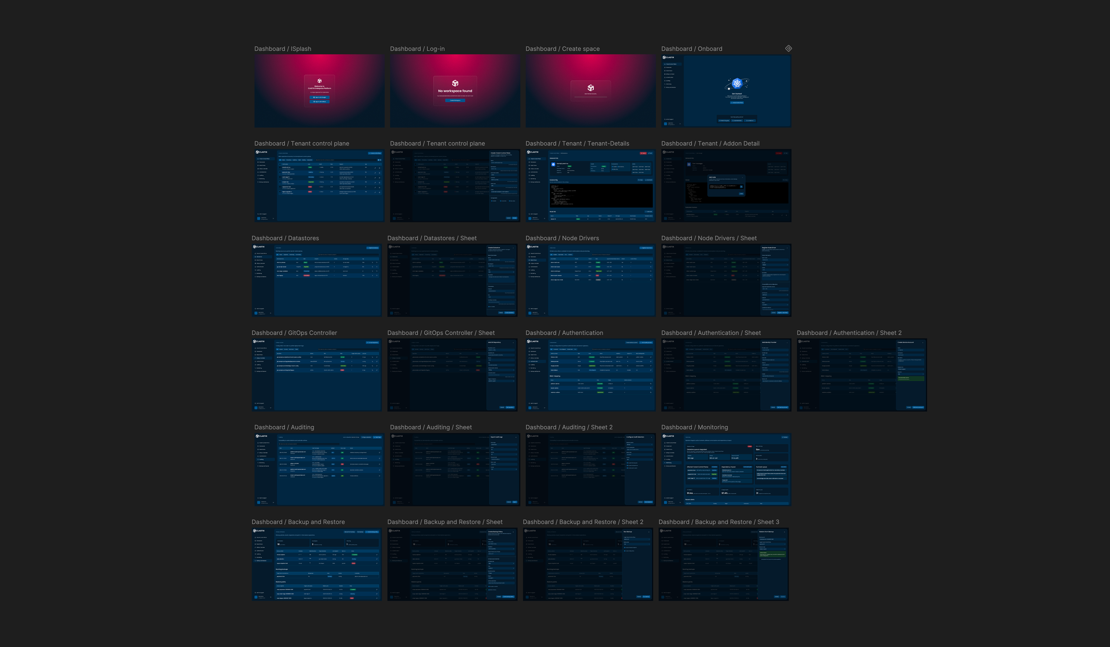
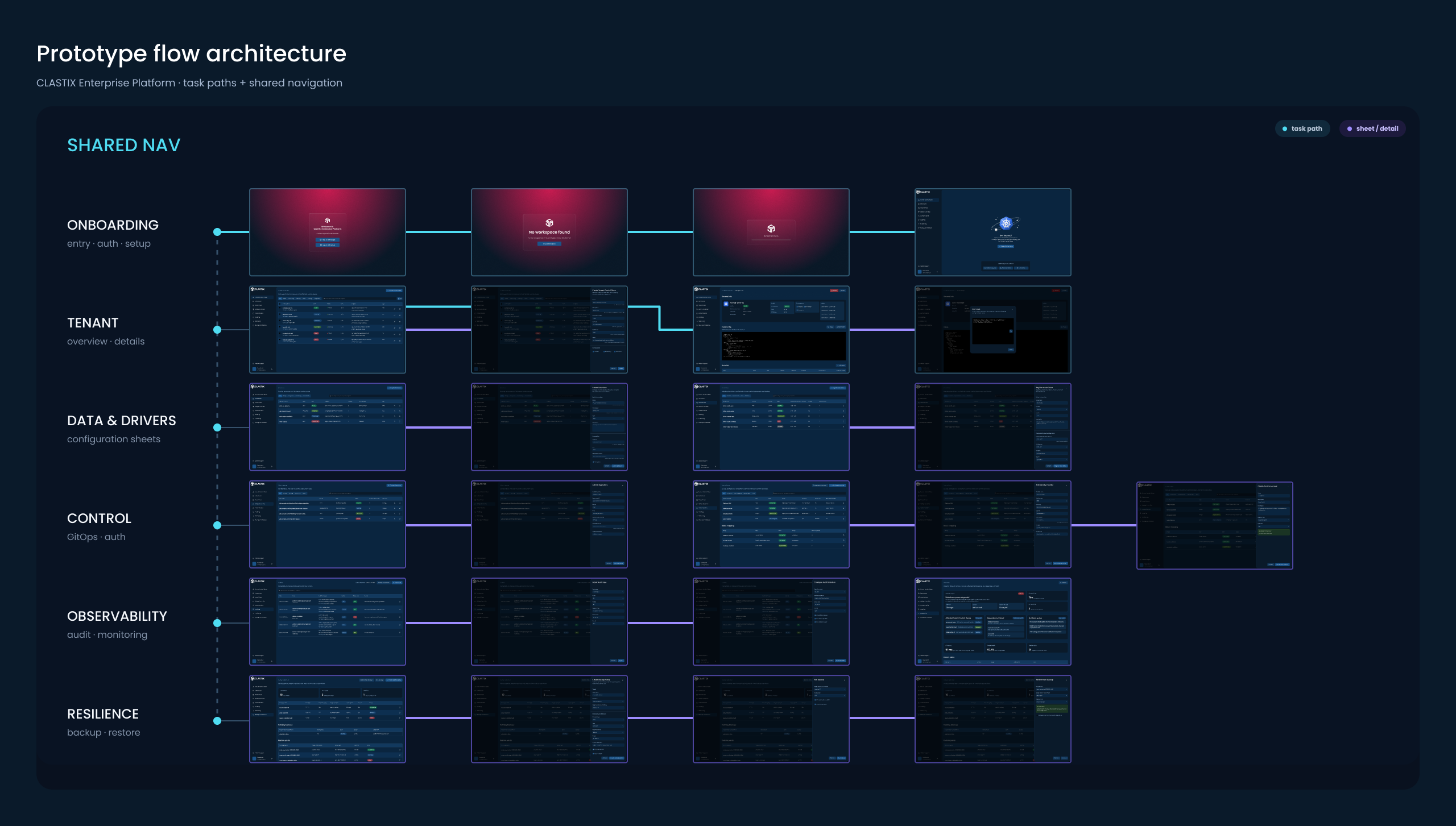
I built a fully navigable prototype, so the development and review team could see the logic applied to each component: what responds to a click, and what transforms according to context or action.
The alternative was to hand over screens annotated with notes and comments. That leaves behaviour to the reader’s interpretation — and behaviour is precisely where a component library goes wrong. A prototype removes the ambiguity by demonstrating rather than describing.
Deliverables
1 prototype
Fully navigable, used by the development and review team as the behavioural specification.
1 design system
Compact: colour, spacing and base components, defined as rules.
25 screens
The interface of the platform console.
20 components
Aligned to the Tailwind scales used on the frontend.
3 flows
End-to-end paths covering the key operator tasks.
Constraints
- Two months, start to delivery.
- Tailwind as the CSS standard, which set the colour, spacing and sizing logic the design system had to speak.
- Launch-stage product: no established patterns to inherit, and no usage data to design from.
- Sole designer, working directly with the Clastix founders and one external frontend developer.
Handoff
I worked directly with the founders and with the external developer building the frontend. The prototype was the point of contact between us: instead of a document describing intended behaviour, the team could operate the behaviour itself. That developer later brought me into RedCarbon as product designer — an engagement that ran for over two years, and which began here.
What I’d do differently
I would extend the research. With more room I would have gone deeper into how these users work, which would have let me propose features rather than only design the ones already on the table — and that is what genuinely helps a development team. In two months, on a launch-stage product with no usage data, that depth was not available. The tooling now makes that kind of groundwork far quicker than it was then.
