Context
Clastix builds cloud solutions for the Kubernetes world. When I came in, the company had two open-source products in active use, Capsule and Kamaji, with adoption at organisations including Fastweb, Wargaming and Nvidia. The goal was twofold: to make Clastix visible as an engineering group in its own right, and to convert that open-source credibility into enterprise versions it could take to large companies.
Conferences were where both things had to happen at once — four of them across a year, from Detroit in October 2022 to KCD Italy in 2023.
- EventsKubeCon NA · KubeCon EU · SuseCon · KCD Italy
- AudienceDevOps, SREs, platform engineers
- EngagementFreelance, external collaboration
Challenge
A KubeCon show floor is a corridor of competing booths, and the people walking down it are engineers — an audience that is fluent, sceptical, and immune to the vocabulary of marketing.
The company had almost nothing to work with: no real brand system, only very basic guidelines, and no visual language that had ever been reviewed. The task was to be recognised in three seconds by people who resent being sold to.
The approach
I decided the booth had to earn attention with something the audience would enjoy recognising, rather than with a claim they would have to read. That meant a hook first, an explanation second — and then, across four events, learning what the hook actually needed to be.
Detroit: a joke they would get
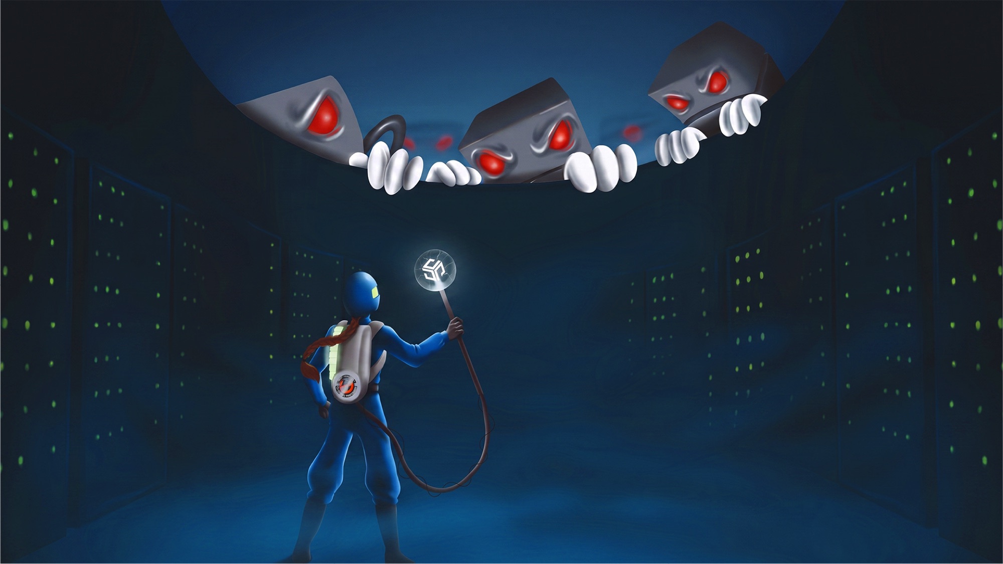
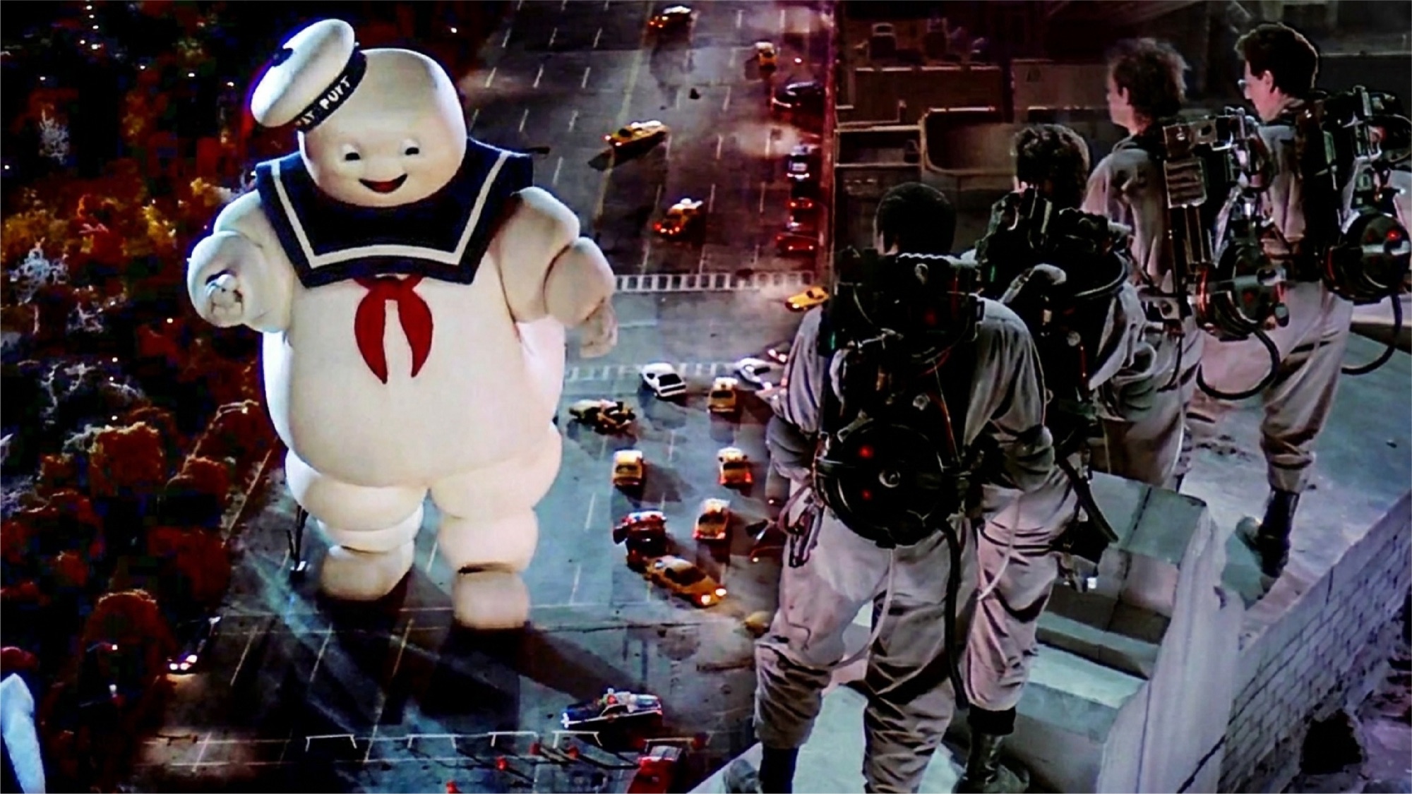
I built the Detroit booth around Cluster Buster — a Ghostbusters reference, with a purpose-made illustration reworking the film’s best-known scene: the marshmallow man replaced by a set of giant servers looming over the city.
The pun does the technical work — cluster is the word the audience lives in — and the reference does the social work. A joke lands as a signal of belonging, not as advertising. For an audience that walks past corporate messaging without registering it, a shared cultural memory stops them.
Amsterdam: from an illustration to a mark
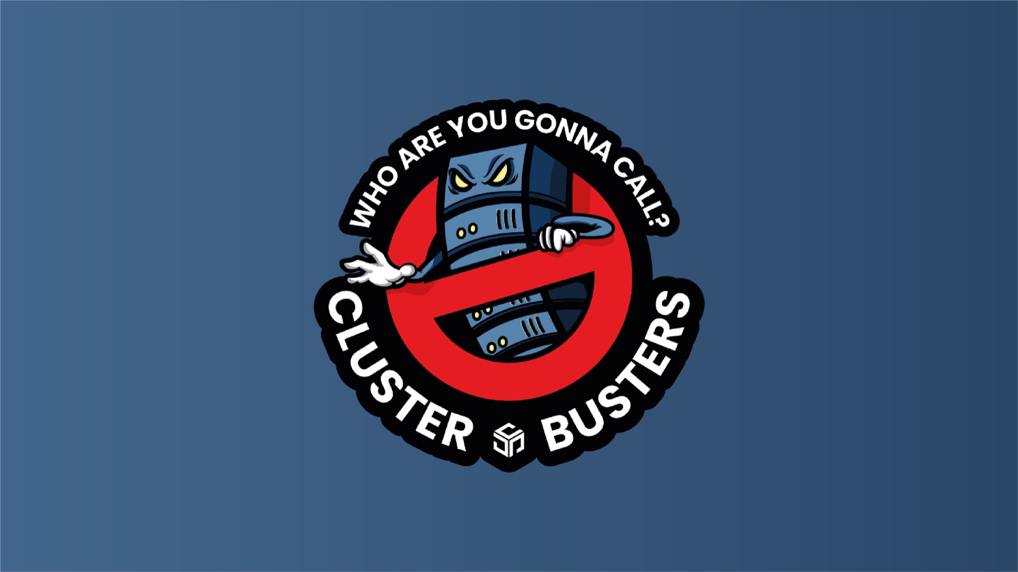
For Amsterdam I stripped the booth back. The illustration came out, and in its place went a single symbol built on the same reference — the ghost replaced by a server.
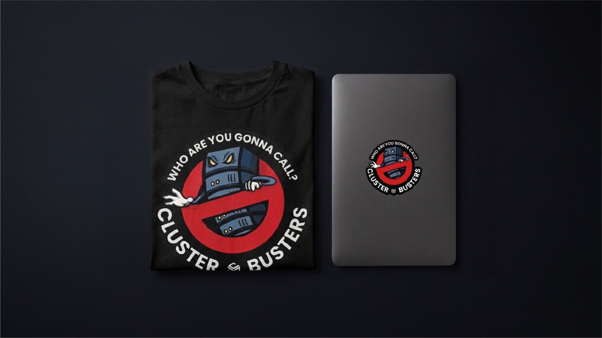
Detroit proved the idea worked and exposed its limit. An illustration is a one-off: it fills a wall, and then it can go nowhere else. A mark can be reduced, reused, put on a sticker, a screen, a t-shirt, a profile picture. Moving from image to symbol turned an event graphic into something the company could keep using.
Explaining the product without stopping anyone
Alongside the booths I produced the visuals, tree diagrams and animations shown on the screens, designed to be understood while someone was still walking.
The booth’s job is to stop people; the screens’ job is to make the product legible in the seconds that follow. Kubernetes multi-tenancy is structural, so it explains best as a diagram — but a static diagram on a show floor is read by nobody. Animation was the way to make structure watchable.
Deliverables
3 booths
KubeCon NA Detroit, 2.1 × 2.4 m · KubeCon EU Amsterdam, 2 × 2.5 m with counter graphics · SuseCon, 1 × 1.5 m.
1 roll-up
For KCD Italy, 2023.
7 animated videos
For the booth screens.
6 social assets
LinkedIn cover and profile images for three events.
Stickers and t-shirts
Produced for SuseCon.
1 reusable mark
Developed in its variants out of the Amsterdam booth.
Constraints
- Fixed event dates: conference deadlines do not move, and print production has to be finished well before the doors open.
- No brand to build on: only very basic guidelines, and an identity that had never been through a design review.
- Production out of my hands: printing and assembly were handled by suppliers contracted locally by the organisers.
- A sceptical audience: DevOps, SREs and platform engineers, who discount marketing language by default.
Events
- KubeCon NA Detroit, October 2022.
- KubeCon EU Amsterdam, April 2023.
- SuseCon, July 2023.
- KCD Italy, 2023.
Production notes
Large-format print is its own discipline. The Detroit illustration was drawn for the booth and then rebuilt for the size it would be printed at — colour, line weight and detail all behave differently at wall scale, and there is no second attempt once the file is with the printer. Working with suppliers appointed by the event, rather than chosen by the client, meant the files had to be self-explanatory. Print production itself was handled by those suppliers; my delivery was the design and the print-ready artwork.
What I’d do differently
I would sequence the work better. The project was a large number of assets, all different from each other, and I would set a clearer order of priority up front rather than letting the variety set the pace. Everything was delivered on time and in fact ahead of the deadlines — but the schedule held because of effort, not because of structure.
