Context
Ditra Software is an academic spin-off of the University of Turin, working on the digital transformation of the medical device supply chain: automating data between systems that do not talk to each other, and tracking devices through distribution so that material stops going missing.
When I arrived the company had just been founded. There was no identity, no visual language, and no logo — nothing to build on and nothing to work around.
- Deliverable coreIdentity system and brand book
- AudienceHealthcare and logistics operators
- EngagementFreelance, direct with the founder
Challenge
A company this young is not only introducing a product; it is deciding what it will be recognised as. Ditra had come out of the medical field, but its actual proposition — complete traceability of materials, and the reduction of loss that follows — is not a medical idea.
It applies wherever things move and get lost. The identity had to serve the company it was, without closing the door on the company it might become.
The approach
I researched the sector’s conventions before deciding anything, and then broke two of them on purpose. Healthcare identity has a narrow visual vocabulary, and staying inside it would have locked Ditra into the one market it happened to start in.
A spark, not a cross
The concept began with a direct link to the medical world, and I moved it away from there. The mark became a spark: a point of light that illuminates, signals, and marks a position — the visual form of complete traceability.
The alternative was the obvious one, and the one the sector expects. I broke deliberately with two of its conventions, iconography and colour palette, so that the mark would read as transversal rather than as medical-only. The idea is not “healthcare”; it is “you can see exactly where every item is”, and that reading travels. Once the spark had replaced the medical symbol, I translated it into a repeatable geometry. The pictogram and custom lower-case logotype share proportions, rhythm and visual weight, making precision part of the form rather than an added stylistic cue.
Built to survive contact with the real world
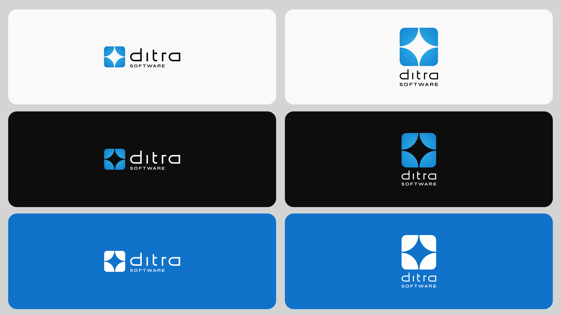
I built the identity as a system: a two-tone gradient from blue to light blue, proportions and clear space set on the golden ratio, several variants of the same mark, and a compact brand book governing their use.
A logo that only works on a white page is not finished. The variants exist for the situations that actually break marks — above all when the logo sits over other elements, where contrast and legibility stop being guaranteed. The golden ratio was used to set proportions and white space so that the construction would feel natural rather than arbitrary, and so that the mark would hold its balance at any size.
Animating the idea, not the object
For the logo animation I chose to convey the spark through movement and through negative space, rather than depicting a spark literally.
This was the hardest piece. The straightforward route is to animate the object: make the mark flash, and call it a spark. But the idea is illumination and signalling, not the light source itself — and the mark had to remain itself throughout, not be squeezed into a movement imposed on it. Working through negative space let the concept appear without the element being forced.
Deliverables
Logo system
Horizontal and vertical lockups with all variants, released as PNG, JPEG, SVG, AI and PDF.
Custom wordmark
Geometric lower-case type, drawn for the identity.
Stationery
Business card and letterhead.
Speech deck
30 pages, built to be used as a template.
Logo animation
Five seconds, built on negative space.
Landing page
Six sections: Hero, About, Product, Partners, Contact, Career.
Brand guidelines
27-page PDF, plus three frames in Figma.
Constraints
- Two months, from nothing to a complete identity system.
- A young company with no design capability in-house: whatever was delivered had to be usable correctly by people who are not designers.
- Sector conventions: healthcare has a rigid visual vocabulary, and departing from it has to be justified rather than assumed.
System
The brand book is the part that makes the rest durable. It covers the variants, the proportions and clear space derived from the golden ratio, the construction grid of the mark, and the rules for the cases where identities usually fail — overlay on imagery, small sizes, single-colour reproduction. It was delivered as a 27-page PDF and as a working Figma file, so the client had both a reference and something they could actually use.
Research
I studied the sector’s competitors before drawing anything. The conventions were consistent and narrow, and I departed from them on two counts — iconography and colour — with the explicit aim of positioning Ditra across sectors rather than inside one. A note on how that has aged: the company has so far remained in medical and pharmaceutical logistics. The decision was not made in the expectation of an imminent pivot; it was made so that the identity would not be the thing preventing one.
What I’d do differently
The identity did what it was meant to do, and the process ran as a brand project should. The one thing I would extend is the end of it. The landing page was designed, approved and delivered, and then never went live — and I found out afterwards. I would build the handover differently: a short implementation checkpoint after delivery, so that work which has already been approved does not stall for want of someone following it through. Delivery is not the same as adoption, and the gap between them is partly the designer’s to close.
