Context
Manager 5.0 is a master’s programme built by Fostering, a collective of lecturers and researchers, and hosted by the University of Turin. Its subject is management in the market that AI is reshaping: how to run a company that is data-driven, sustainable and still human-centred.
The programme needed a site of its own, and it needed it to work within a fixed window: the weeks in which prospective students decide whether to enrol.
- Build platformFramer
- AudienceProspective students, three profiles
- EngagementFreelance, direct with the programme owners
Challenge
The source material was academic — thorough, verbose, dense with detail, and written for people who had already decided to be interested. A prospective student has not decided yet.
The work was to compress that body of material into something a stranger could move through, and to build a visual language capable of carrying it, since none existed.
The approach
I treated the site as a sequence rather than a document. What someone needs to know first is not what the programme most wants to say first, and the gap between those two orders is where most institutional websites lose people.
Structured pages, not one long scroll
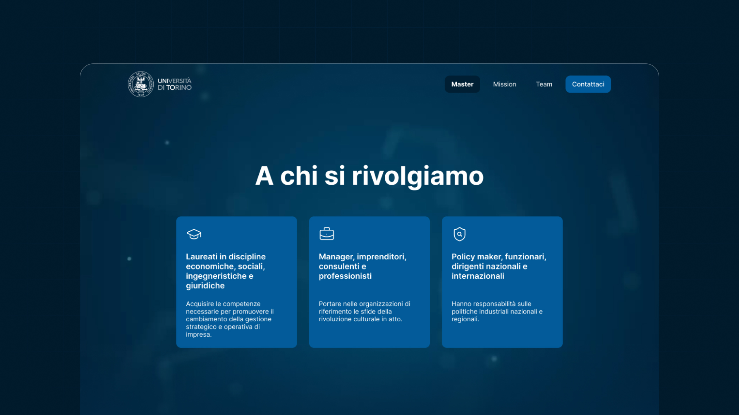
I split the content into distinct pages, each holding one stage of the decision, instead of collapsing everything into a single scrolling page.
A one-page site was the obvious alternative, and the wrong one here: with this volume of material it produces an endless scroll where the important passages sink. Separating the content let each page carry one question a prospective student actually asks, in the order they ask it.
A visual language, not stock photography
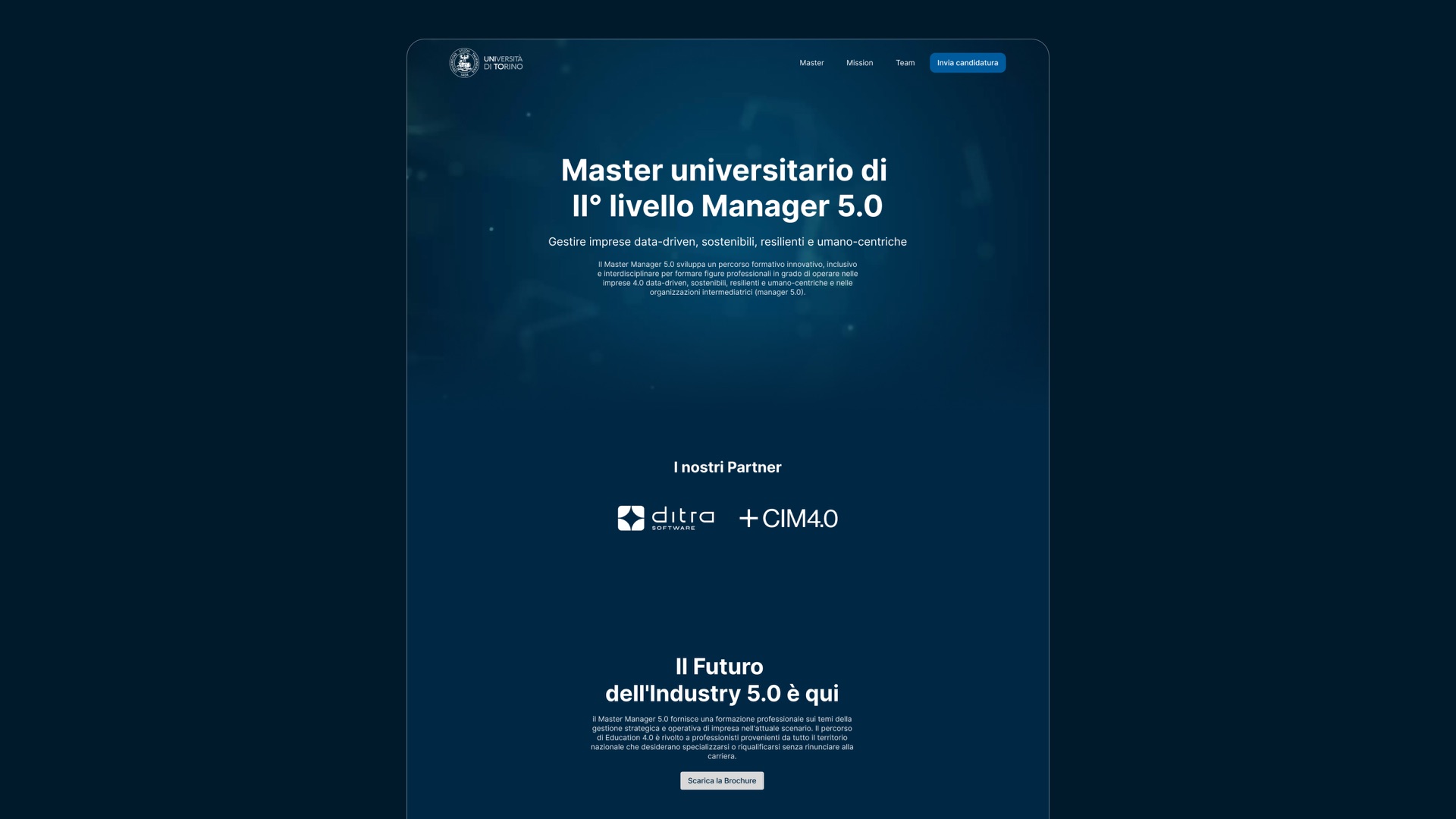
I built a colour and visual system for what entrepreneurship looks like in an AI-shaped market, rather than using the stock image set the client had provided.
Those images were the sector’s standard clichés — hands holding holographic elements, and the rest of the vocabulary that signals “technology” while meaning nothing. For a programme whose entire proposition is that this shift is real and worth studying, that imagery would have undercut the message on sight.
Framer, chosen for who would inherit it
I built the site in Framer rather than WordPress.
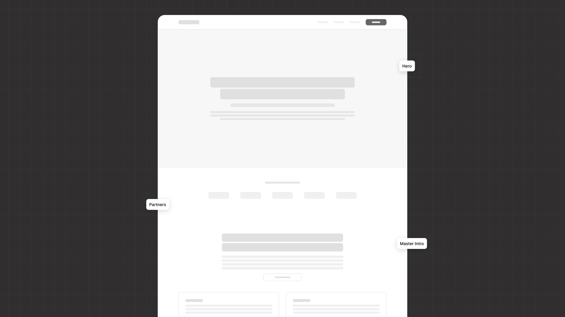
WordPress is a dependable platform, but it carries a maintenance burden the team could not sustain — and a site nobody can maintain degrades in public. Framer let me build quickly, kept editing limited and non-destructive so the client could not break the layout, and left room for the programme to add a blog later if it wanted one. It also let me move directly from Figma into the build, which is why the schedule held.
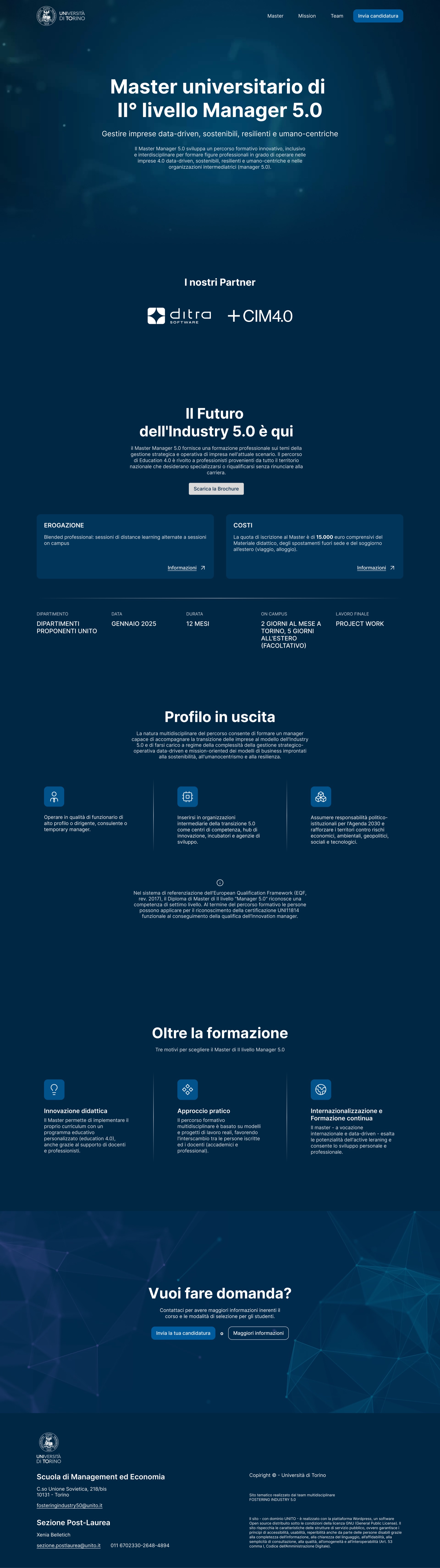

Scroll each view independently to inspect the full page.
Deliverables
6 pages
Each with its mobile breakpoint.
4 interactive components
Built to be operated by the client after delivery.
3 user flows
Covering the paths from first visit to the contact form.
1 prototype
Used to validate the sequence before the build.
Visual language
A complete system, produced for the programme from scratch.
Constraints
- Accessibility to public-administration standards, covering the full range of disabilities.
- Limited authority over cuts: the material had to be compressed, but what could be removed was not my decision alone.
- Budget, which ruled out both alternative builders and any ongoing maintenance commitment.
- A fixed window: the site had to be live and working before enrolment opened.
- No developer: design, build and delivery were all mine.
- Institutional identity: the University of Turin constrains only correct use of its logo, not site style.
- Institutional approval: the commission came from Fostering, but the project still had to be approved by the University of Turin before going live.
Information architecture
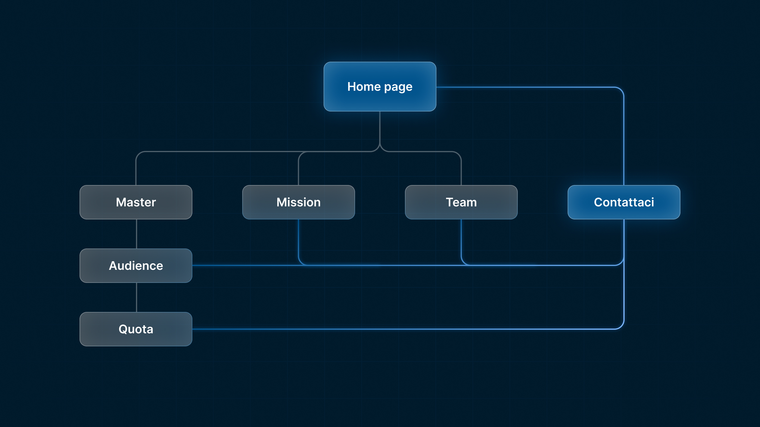
The structure was derived from the order in which a prospective student decides, not from the order in which the programme is described. Each page answers one question and hands over to the next. That sequence is the actual design work on this project; the visual language exists to carry it.
What I’d do differently
I would compress the meetings. The extraction phase was necessary, but it ran longer than it needed to; I would consolidate it into fewer, tighter sessions and hold firmer control of the conversation. The information would have been the same. The calendar would not.
