Context
RedCarbon builds AI-driven products for security operations. Its public site, however, had grown by accumulation rather than by design: it described the technology at length without ever telling a visitor what the company concretely did, or which of their problems it solved.
The company had also moved on. What the site presented as a single AI platform had, in reality, become a range of distinct products — each with a different job, and a different buyer.
- Build platformBuilder.io
- AudienceSecurity buyers and CISOs
- EngagementFreelance, external collaboration
Challenge
The old site told the story of the product without a strategy behind it. It listed capabilities, explained internal methods by their internal names, and described the interface rather than the outcome. A visitor could read the whole home page and still not know what to buy or why.
Since each product had its own purpose and its own audience, fixing the copy was not enough: the structure underneath had to be rebuilt first.
The approach
I started from the org chart of the offering, not from the pages. Once it was clear how many products there were, who each one was for, and what each replaced, the site could be laid out to match. The architecture came first and went to the board for approval; the pages followed from it.
One platform became five products
I restructured the offering into five named products, each with its own page, audience and entry point: AI Analyst L1, AI Analyst L2, AI Threat Hunter, AI Threat Intelligence Analyst and RedGuardAI.
The previous site presented a single AI system followed by a list of seven capabilities. That structure asked the visitor to work out for themselves which part of it applied to them. Naming the products moved that work from the reader to the company.
Positioned by what it replaces
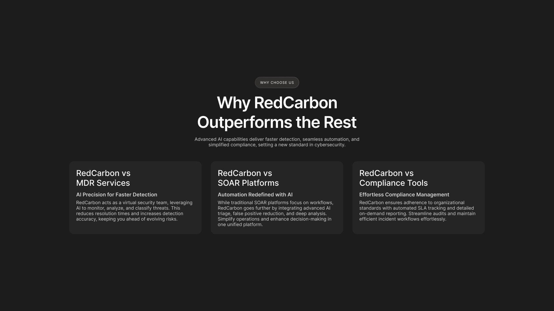
I built the home page around a comparative section that states which category RedCarbon competes in and what it displaces: against MDR services, against SOAR platforms, against compliance tools.
Security buyers are not empty-handed. They already run something, and their real question is not “what is this” but “what does this replace”. The old site never answered it, so the visitor had to place RedCarbon on the map themselves — and most would not bother.
Designed for a page builder, not for a handoff
The development team chose Builder.io, so I designed a component system a non-designer could recompose without breaking it, rather than a set of fixed page layouts.
This inverts the usual handoff. In a normal build, the design is the specification and development implements it. Here the client would keep editing the pages after launch, so every layout had to remain coherent under recombination, with rules built into the components rather than held in my head. I also built it: rather than hand the system over and hope, I spent a week inside Builder.io, learning its behaviour and resolving interaction problems the tool exposes in developer terms rather than designer ones.

Deliverables
Information architecture
Full architecture of the offering, approved by the board.
12 pages
14 including EULA and Security Information: five product pages, About us, Careers, Get a Demo, blog and news templates.
Component system
Built for Builder.io, designed to be recomposed by the client after launch.
Build
The pages built in Builder.io, including the interaction work the tool did not handle natively.
Copy contribution
Wording proposed on the basis of domain knowledge and approved by the client.
Constraints
- Technology fixed before design: the build ran on Builder.io, chosen by the development team.
- Approval at board level: the architecture was a commercial decision as much as a design one.
- Two months from start to launch, most of it approval time.
- Copy ownership: final texts were produced by the client, after the architecture had been approved.
Information architecture
The restructure began with the offering rather than the sitemap. Each product was defined by its job, its audience, and the thing it replaces; only then did it become a page. That sequence is what made the comparative positioning in Decision 02 possible — it could not have been written before the products were separated.
Handoff
Design handed over to a build the client could edit. That shaped the work in both directions: components had to carry their own rules, and the design had to tolerate arrangements I would not choose. The trade was deliberate — the client gained independence, the layouts gained exposure.
What I’d do differently
I would push the narrative further and carry it with stronger visuals. The site does its structural job, but it tells its story mostly in words. Recent developments in AI-assisted image work make that kind of visual production far quicker than it was — and on this project time was the binding constraint, not ambition.
